Reports show you what happened. Dashboards show you what’s happening right now. Dashboards are where most operators should start. They’re the fastest way to get a real-time picture of your business without digging through tables.
ServiceTitan dashboards are more powerful than most contractors think. This walks through the key dashboards, the KPIs that matter, and how to set up the right views for the right people.
Dashboards vs. reports
Dashboards show real-time or near-real-time data. Use them to monitor what’s happening today, how the week is going, whether the board is full, if techs are running on time.
Reports show historical data. Use them to check last quarter’s margins, compare February to February last year, or see which job types are most profitable.
Both use the same Reporting 2.0 engine, but the purpose is different. Don’t use dashboards for deep historical analysis. That’s what reports are for.
Before you build custom dashboards, get comfortable with 2.0 reports first. Custom dashboards require understanding data sets and how KPIs are calculated. If you’re not there yet, stick with the pre-built dashboards.
Built-in dashboards
ServiceTitan comes with several pre-built dashboards you access from the dropdown in the top left of the Dashboards screen:
- Modular Dashboard — the default landing page, general business overview
- Service Manager Dashboard — field operations and technician performance
- Business Owner Dashboard — revenue, margin, and growth
- CSR Manager Dashboard — call booking, booking rates, agent performance
- Residential Template — general residential business overview
Click the bookmark icon to set any of these as your default. Match it to your role. A dispatcher needs something different than an owner.
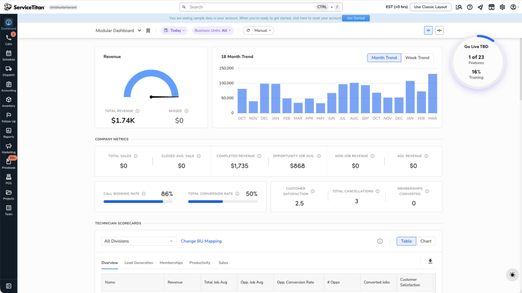
The Modular Dashboard: A Section-by-Section Breakdown
The modular dashboard is what you land on when you first open ServiceTitan. Here’s what each section does.
Revenue Gauge
Shows total revenue for your selected date range compared to “missed revenue” estimate. Trust the total revenue number. The missed revenue number is directional at best. It’s based on unbooked calls, unconverted jobs, and canceled jobs multiplied by average rates. It can’t account for why calls weren’t booked or why jobs didn’t convert. Don’t optimize around it.
18-Month Revenue Trend
This is the best tile on the dashboard. It’s a bar chart of monthly revenue over 18 months with year-over-year comparison when you hover.
Hover over any month to see this month vs. the same month last year. You get an instant read on whether you’re growing, flat, or declining, and when. For seasonal home service businesses, year-over-year comparison matters way more than month-to-month. Toggle between monthly and weekly view depending on what you need.
Broad Company Metrics
High-level KPIs like total jobs, average ticket, conversion rate, and others. Hover over the info icon on any metric to see how ServiceTitan calculates it. Don’t assume you know what it means. Definitions matter.
Technician Scorecards
Shows each technician’s performance metrics as a chart or table. Filter by business unit and click into individual techs for details.
Key: pick the right mode. The wrench icon is for service techs (conversion rate, average ticket). The dollar sign is for salespeople (close rate, revenue per lead). Using the wrong mode gives you misleading numbers.
Click any tech to see their performance broken down by job type (service, install, maintenance revenue %) and call details.
Call Metrics
Shows call volume, booking percentage, and call recordings you can listen to and reclassify. If booking percentage drops, start here. Listen to calls to understand why customers aren’t being booked.
CSR / Agent Scorecards
Like technician scorecards but for office staff. See total calls, classified leads, booking rate, and excused calls for each agent. Click any agent to see their full call detail.
Marketing Scorecards
Calls and revenue by marketing campaign. Quick way to see which channels generate bookings and revenue without running a full report.
Heat Map
Revenue distribution across your service area, color-coded by intensity. Darker means more revenue. Toggle between revenue view and job count view.
Use it to spot areas where you’re strong (and could double down on marketing) and areas with low density that might suggest dispatching problems.
Setting the date range
All tiles use the master date range selector at the top. Default is “Today”. Change it for different needs:
- Today — morning meetings, real-time monitoring
- This Week — weekly check-ins
- This Month — monthly reviews
- Custom range — specific periods
Set auto-refresh (10 min, 30 min, 1 hour) if you’re displaying the dashboard on a TV. Manual is fine for personal use.
Role-specific dashboards
Service Manager Dashboard — for people running the field. Focuses on technician performance, job completion rates, operational metrics. If the modular dashboard feels too broad, use this.
CSR Manager Dashboard — call center performance, booking rates, agent scorecards, call classification. For anyone improving office-side conversion.
Business Owner Dashboard — higher-level view of revenue, margins, and growth trends. For owners who want to see the business story without operational details.
Custom dashboards
Once you’re comfortable with Reporting 2.0, build custom dashboards that display exactly the KPIs you care about in the layout you want. Custom dashboards pull from the same data sets as reports. You can display any KPI as a tile, chart, or graph. This is where you build your “north star” dashboard specific to your business.
You need to understand what each data set contains and how KPIs are calculated first. Build reports first. Understand the data. Then build dashboards on top.
Permissions and access
Dashboard access is permission-controlled. Not everyone needs to see everything. A dispatcher doesn’t need to see gross margin data. A technician shouldn’t see other techs’ commission totals.
Configure permissions to match roles. This matters especially if you’re displaying dashboards on shared screens. Make sure the visible data is intentional.
Frequently Asked Questions
What’s the difference between the Modular Dashboard and custom dashboards?
The Modular Dashboard is pre-built and fixed. Custom dashboards let you choose which KPIs appear and how. Custom dashboards need more setup but match your specific needs better.
Why do dashboard numbers not match report numbers?
Dashboards are real-time or near-real-time. Reports may require closed accounting periods or posted invoices. Report numbers are more accurate for historical analysis.
Can I share a dashboard with my team?
Yes. Dashboard access is controlled through permissions. You can set a default dashboard for different user roles.
What is “missed revenue”?
It’s an estimate of potential revenue from unbooked calls, unconverted jobs, and canceled jobs. It’s directional, not precise. Use it as a signal, not an obsession.
How do I set up a technician scorecard correctly?
Select the right mode (wrench for service techs, dollar sign for salespeople). Make sure your business units are correctly mapped to divisions. Wrong division mapping miscategorizes metrics.
The bottom line
Match the right dashboard to the right person and context. The modular dashboard is a solid general overview. Role-specific dashboards give focused views for service managers and CSR managers. The 18-month trend tile is the best quick-read on business health. Custom dashboards let you build exactly what your business needs once you’re ready.
Start with the pre-built dashboards. Learn what each metric means. Graduate to custom dashboards when you need something more specific.
Related guides: ServiceTitan job costing and ServiceTitan Configurable Payroll.